
Get the fundamental Color Theory and learn how to use this knowledge to your advantage.
What is color theory?
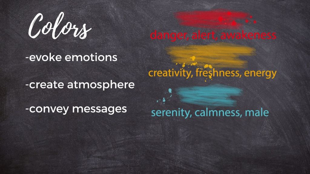
It is the science and art of understanding how colors can be used to create appealing visual designs. In graphic design, the use of color can evoke emotions, create mood, and convey messages. It is essential to have a good understanding of color theory to create effective and impactful designs.
Explaining the Color Wheel
Tints
Adding white to any hue will give you a tint. Depending on how much white is added, you will get a variety of tints for each hue.
Tones
Adding Grey to Any Hue will give you a tone. Depending how much black and white is added to achieve grey you will get a variety of tints for each hue.
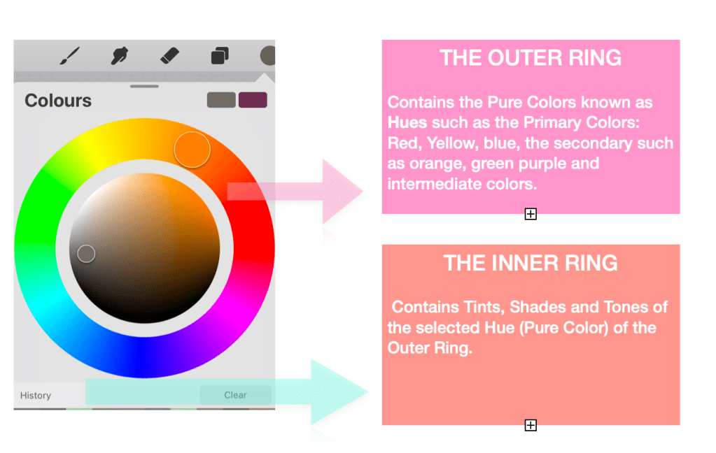
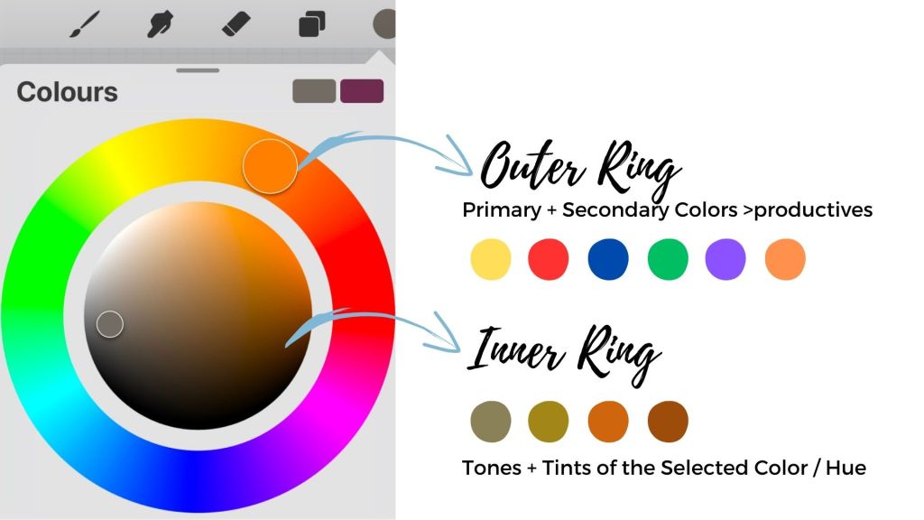
Classic Representation of the Color Wheel at Procreate
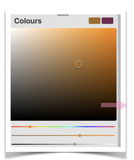
In this classic representation of the color wheel, the upper slider represents the hue, the middle slider is for the saturation of the color, and the last slider controls the lightness or darkness. This is how we create tints and tones.
Now that you know about hues, tints, and tones, things are starting to come together. Let’s sum it up:
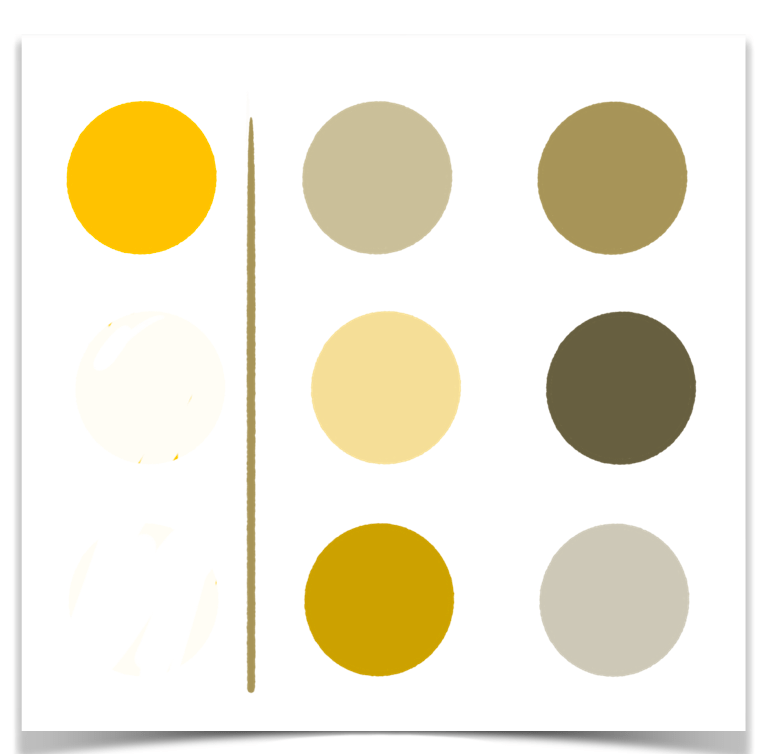
One hue can provide us with multiple tints and tones. Adding values closer to black will provide us with shades of the same color. Tints, tones, and shades are achieved, as we said, by maintaining the base color (the hue) and playing with the saturation and the lightness/darkness slider.
This type of palette, which consists only of tints and shades of the same base color, is called monochromatic and is used to achieve a harmonious and peaceful result.
Depending on the mood and project, you may decide to go for warm or cool, muted or vivid, or light or darker tones.
For a more balanced composition: Try to ensure that your range of colors falls within the same type of gamma.
Since I mentioned the word “harmonious” above, it’s time to talk about color harmony.
What is Color Harmony?
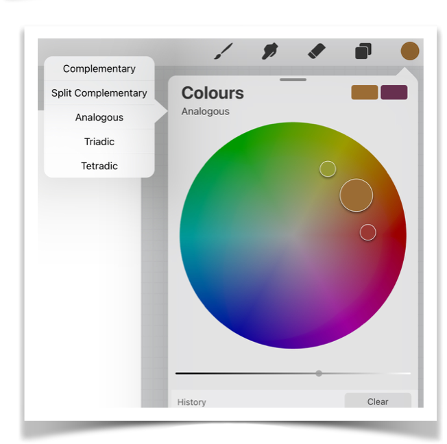
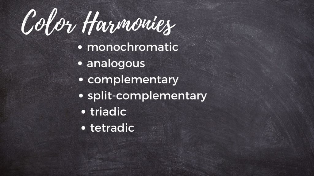
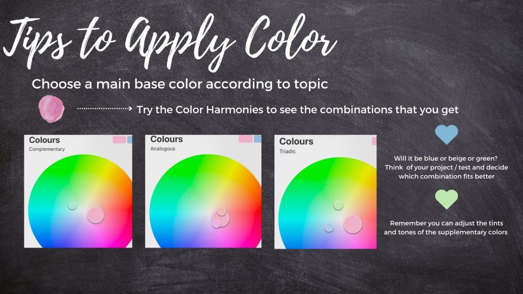
Color harmony is the use of colors in a way that creates a pleasing and balanced composition. There are different types of color harmonies, including monochromatic, complementary, split complementary, analogous, triadic, and tetradic.
Monochromatic color harmony uses different shades, tints, and tones of a single color. This creates a subtle and harmonious design.
Analogous color harmony is the use of colors that are adjacent to each other on the color wheel. For example, yellow-green. This creates a cohesive and soothing design.
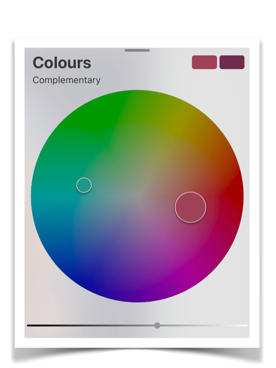
Complementary color harmony is the use of colors that are opposite each other on the color wheel. For example, red and green or blue and orange. This creates a bold and vibrant design.
Split-complementary uses a base color and two colors that are adjacent to the opposite side of the color wheel. So, it gives you three basic colors.
Triadic color harmony is the use of three colors that are equidistant from each other on the color wheel, for example, red, blue, and yellow. This creates a vibrant and dynamic design.
Tetradic is achieved by the combination of four colors made by 2 complementary color sets.
In Procreate, you can access these palettes by tapping the color and then selecting the Harmony option.
Creating Your Own Palettes
Theory is great, but how do you apply all of these to your drawings and paintings?
Apart from knowing technically how to create a palette – which is the easy part – you must know and how to apply it. Color application can be tricky, but I hope the following tips will help you improve your skills. Personally I am still experimenting a lot with color > try practising on your own creating various themes based on the different color harmony palettes to see how they work.
Color palette choices depend on the project and the mood we try to express/cultivate through our illustration.
Generally, it’s safer to pick a base color that you believe expresses the mood or the subject of your illustration. Then it’s up to you to decide how you want to work with this color.
Color harmonies provide a safe place to begin with. So you can choose to create a monochromatic palette based on the hue you have chosen or a split-complementary palette with 3 basic colors if you are going for something vibrant.
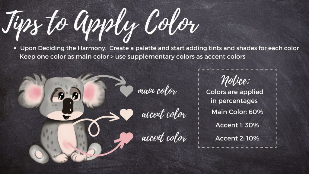
When dealing with multiple colors, try to maintain a balance:
We mostly use one color out of the three as our main color, and the other two as accent colors. These accent colors serve as supplementary colors, which we apply to our details, parts of the background, and other decorative aspects of the design in a much lesser percentage than the main color.
Developing a Color Palette
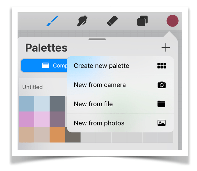
To Create Your Own Palette in Procreate, tap the Color Circle and choose “Palettes” from the bottom list. Press the “+” sign, and you can create your own palette from scratch or let Procreate create a palette for you by choosing the other options. This is great when you are trying to match the colors of a photograph, such as a natural landscape, animals, or even a specific mood like film noir since you don’t have to guess colors.
How to Apply Colors:
Start by applying your basic colors, the ones you want to use or the ones that were given to you from the color harmony, to see how this combination feels and how well it fits your project.
Once you decide on the positioning of your basic colors, you can start adding to your palette the tones and tints that will help you further transition colors.
Create at least a tint and a tone for each hue, following the procedure we mentioned above: keep your hue stable and just change the value of your light and shadows and saturation using the sliders. Then add these to your palette. This will help you add a greater variety of tones, shadows, and highlights for more perspective and depth to your artwork.
For the main color, you can use more tints and tones as it will be your primary color. By adding these new colors to your palette, you can maintain a certain mood across your artwork.
Use the palettes to create color themes that can help you apply color fast upon subject. Then create a more specialised palette for each artwork.
Are we done?
Hmm, not completely. Lastly, I must refer to the shadows. When drawing, it’s a huge matter because shadows make all the difference between a bland or a multi-dimensional subject.
So, how do we apply shadows?
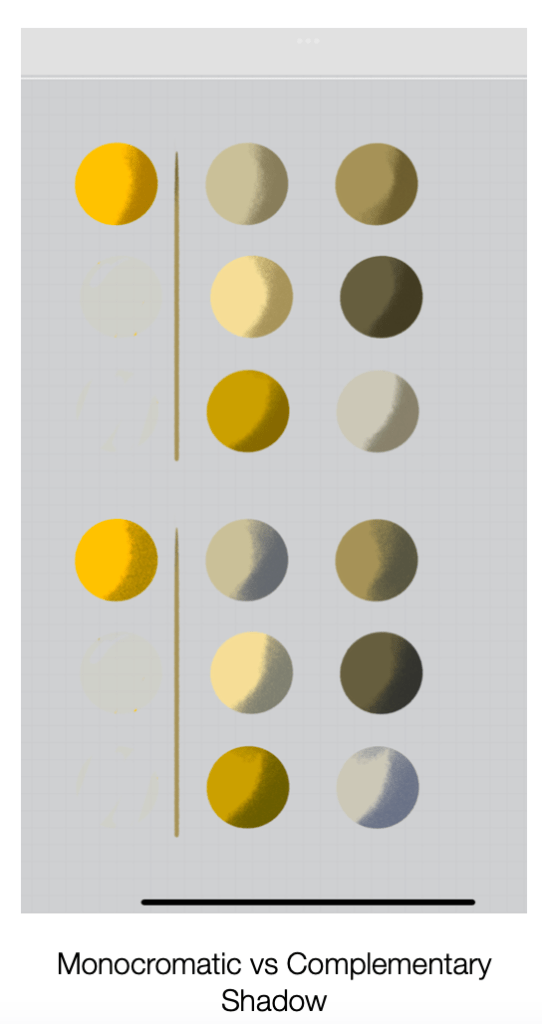
Shadows should be applied by using a darker, more saturated tone of your base color you have used or the dark tones of the complementary color of the color you are using. You can easily find the complementary color by using the harmony panel as we mentioned.
The latest option is said to bring more lively results but really depends on the theme. To apply the shadow, use a new layer set to multiply and clip it to the layer below. Adjust the opacity to your desired level of transparency. Play with the opacity to fine-tune your shadow as you want it. Since shadows are a broad topic, they will be discussed in more detail in another post.
For now, experiment with your colors and have fun!
