We often see letters and we don’t know what we see but since we want to manipulate text and play with it to create interesting quotes, lettering, or even fonts, we can’t ignore the basic structure from which we can take the liberations and create many interesting projects.
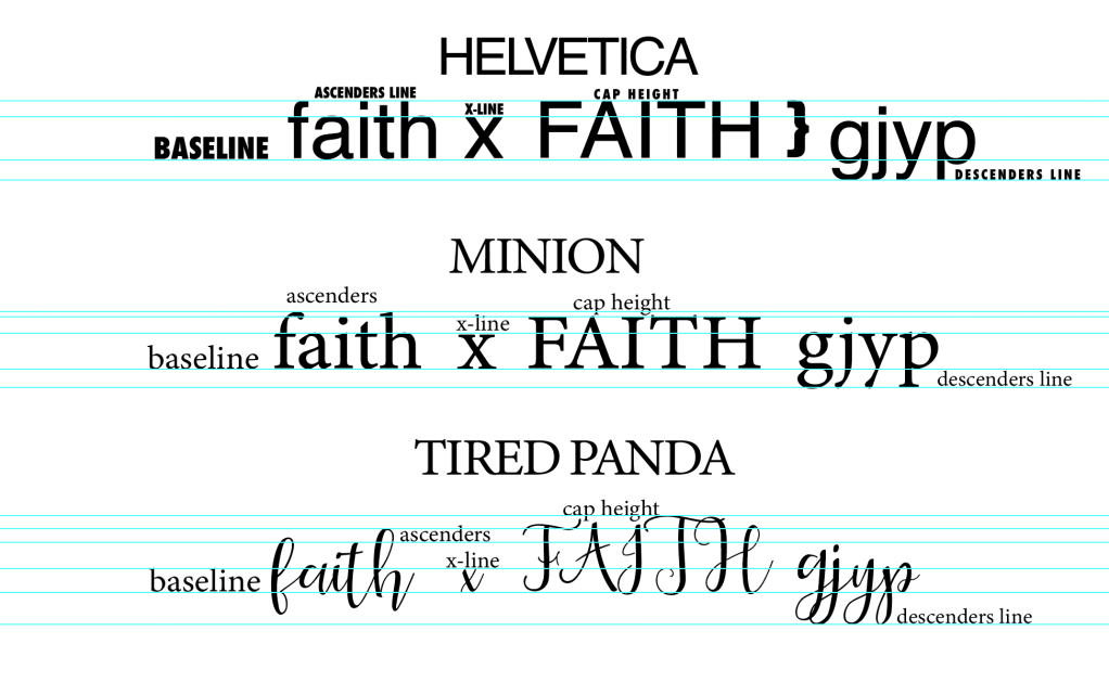
If you feel intimated by what you see don’t be. Notice that in the upper diagram we have 3 different fonts: A sans-serif which is Helvetica, a Serif which is Minion, and Tired Panda a script font. Let’s break down what we see:
The baseline
The baseline is as you can see the line where the letters actually sit. So if you put them in a line altogether or you start typing this invisible line that acts as a ruler for the letters to sit is the baseline.
The x-height
The x-height is the height of the letter x as crazy as it sounds. Also called the corpus size defines all letters’ main body let’s say. This is pretty forward for letters such as a, o, v, w, and c but let’s say that you have a letter such as g or d. Apparently, these letters don’t actually fit in the x-height since they have edges that go below or above the x-height. We call these letters ascenders and descenders and in the image above you can see the rulers that define them.
The ascenders line
Refers to the height from the baseline for the letters that extend beyond the x-height: b, d, f, h, i, j, k, l, and t.
The descenders line
Refers to the height from the baseline for the letters that extend below the baseline such as g, j, p, q, and y.
The Cap Height
So Capital Letters have their own height and if you observe my diagram you will see that their cap height is slightly lower than the ascenders line.
So now that we learned the basic guides you should have in mind let’s see the example of Tired Panda. It’s an example of a great font that breaks the rules but apparently also knows them too well. You see typography is flexible. And this is what makes it so interesting. So in Tired Panda, I want you to observe how nothing is in line. Each letter of the Caps seems to have its own height, and so do the ascenders and the descenders. So if you are hand-lettering or you want to create your own fonts or even quotes you can play and adjust all these guides to the extent that suit you. But make sure you know them too well and are fully acquainted with the proportions and the idiocrasy of each letter.
In the next lesson, we are going to see letters that match, letters that create problems, and combinations you must be aware of…and of course how to take advantage of the disadvantages to make your work more playful.
And since I mentioned Tired Panda, let’s give a token to the creator, you can get it both for personal and commercial use here
