There are many ways to color in Procreate, but today I am going to show you the quickest one, one that requires only Procreate Brushes and any digital coloring page you have available. Still, if you wish to follow this tutorial you can download our free summer pallet and also our coloring page example.
In any case, if you have a problem downloading let me know. You can import both files through your Procreate App. You can also create a new document and import the file. I recommend the file size of 12X12 inches so you can color with ease. Without another delay let’s start this basic procreate coloring tutorial.
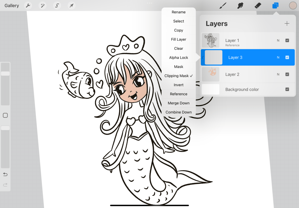
- Create a layer underneath the initial sketch layer.
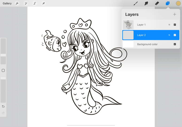
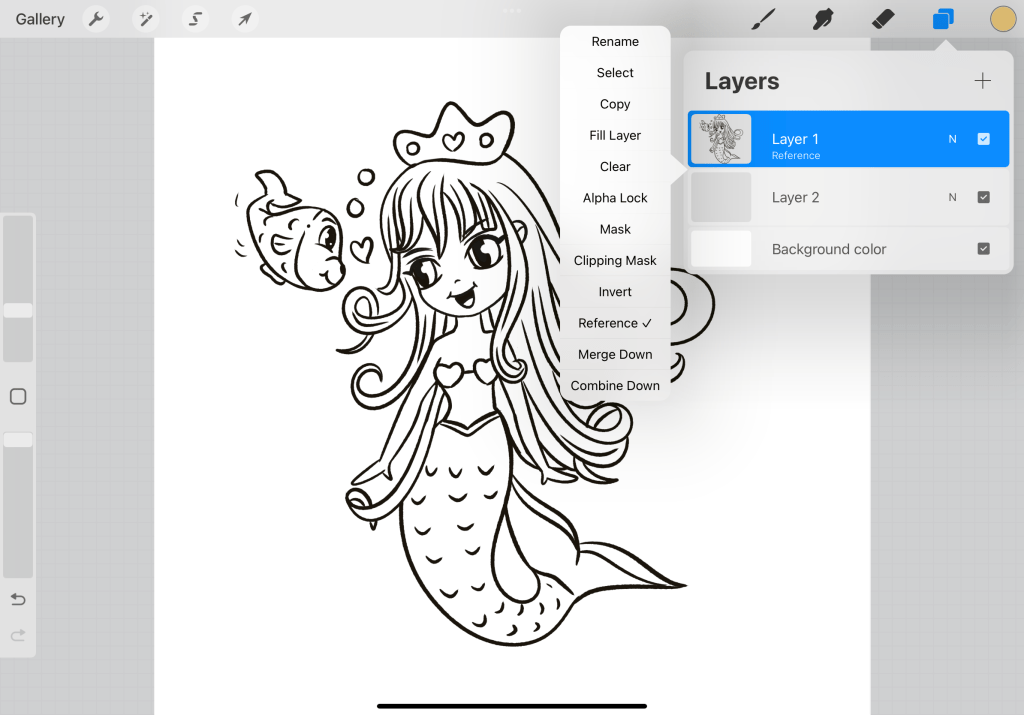
Set the initial sketch as a reference. This will make sure that any new layers you create refer back to this layer.
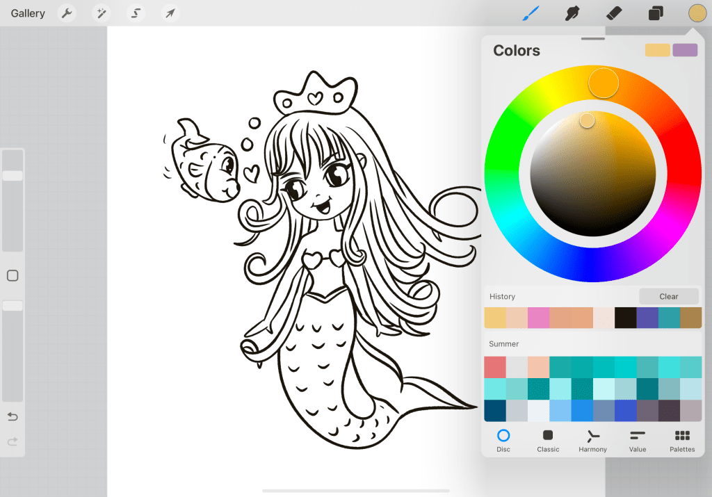
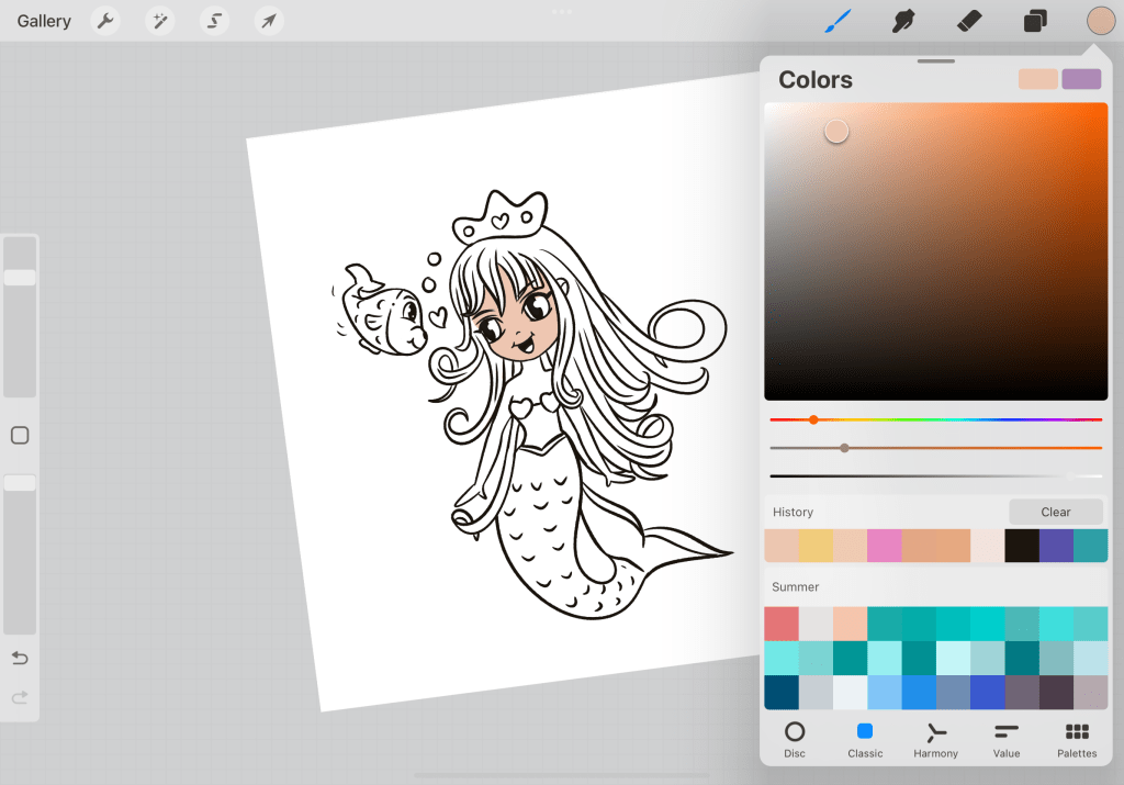
Upload the summer palette and set it as default from the palette menu so you can have quick access to it.
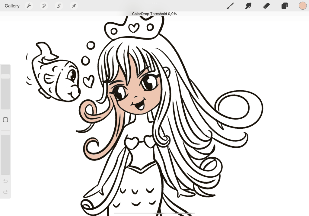
Select the beige color and from the top right panel (where you see the circle with the color) just drag it with your pencil over the area you wish to color. Here I have dragged it over the face. You may need to adjust the coloring by keeping your pencil down and moving the slider left and right until you get a good balance. This happens when all lines are completely close. But it’s also part of any coloring process so just bring it the slider as closer as you can to the desired result and you can erase the rest using the eraser.
See I cleared this area so we can continue. Using the same color drag it to fill the shoulders and belly. The color I initially chose is too saturated so let’s change that. Use the Classic view at the pallet panel… There you have three sliders. The first controls the hue (let’s say color tone), the second the saturation, and the third the darkness and lightness. We want to decrease saturation so move the middle slider more to the left to town down the color. This will give you a new watch. Of course, you can adjust it, as you see it, fitter, to your liking, the idea here is to become acquainted with the classic view of palettes and how this specific mode helps you have more control over your color.

So drag the new color and this will replace the old one.
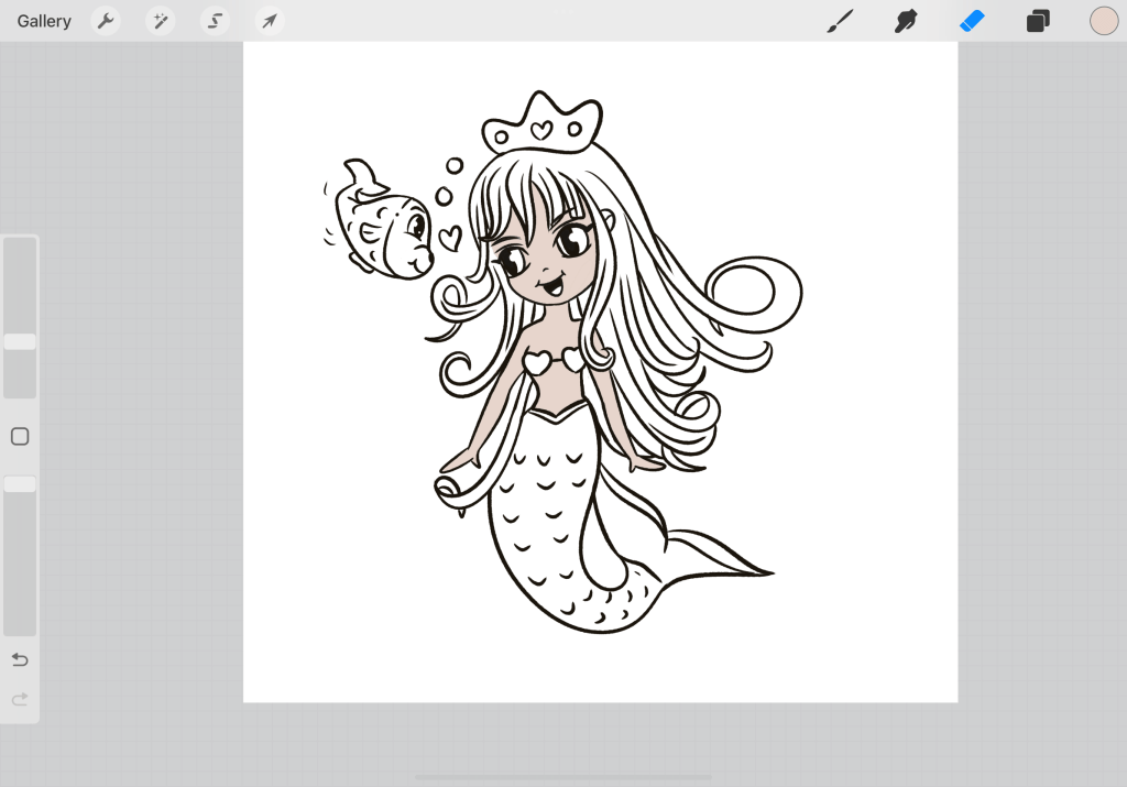
Continue with the drag and drop until you fill the body.
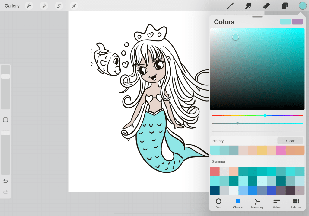
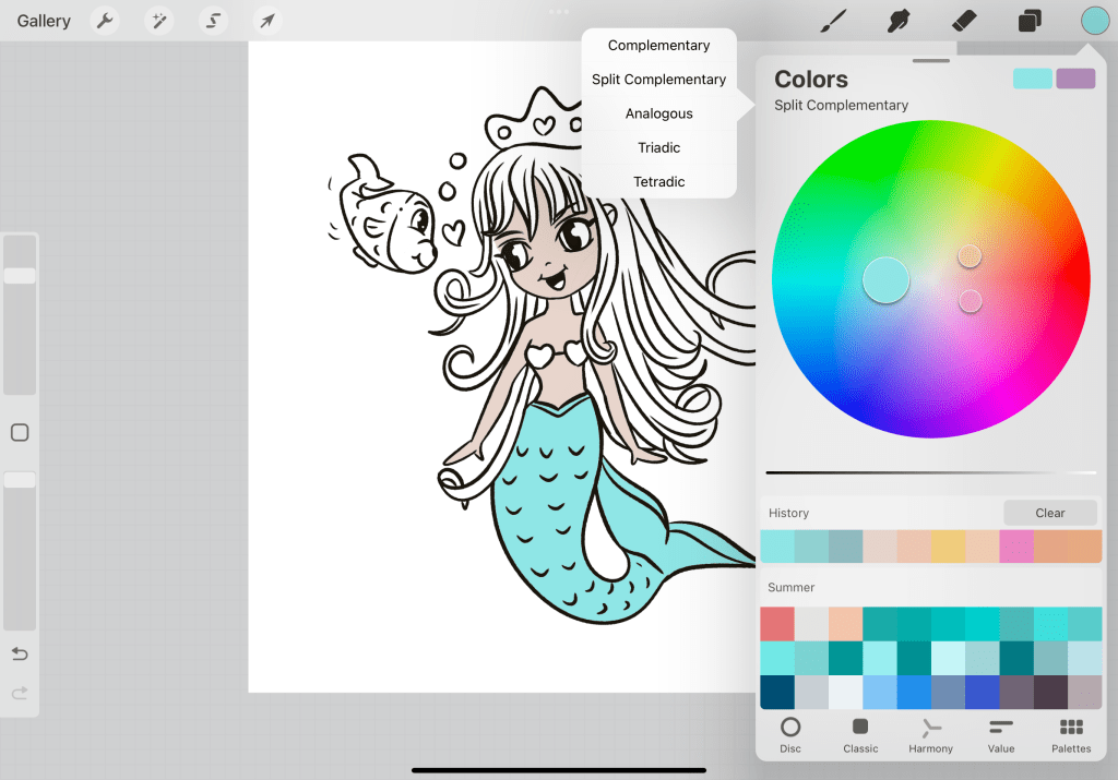
Once you are done (make sure that your reference and your colored body are 2 different layers)…use a color for the tale. In particular, I have chosen the light blue on the left (the one that has the coral on top and the deep blue beneath.) Now let’s find colors that really match the colors we have used so far. Tapping on the circle of the color you have chosen go to Harmony. There you can choose among complementary colors, split complementary, analogous, triadic, and tetradic. Don’t be intimated by the names. All these are just different color type combinations that work well with a selected color. This is not the time to go deeper into these> but here I have chosen Split commentary so I can work with 3 colors and also create a contrast. So it gives me a saturated yellow and pink color.

Start coloring the bra pink.
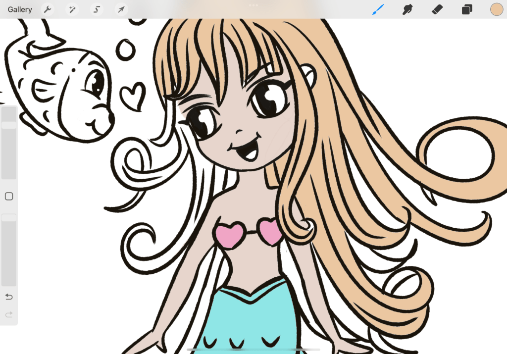
And the hair with the yellowish color that it gave me. Don’t get confused with the image above, it gave me the split complementary tones for pink because I selected it to color. Color pink the light blue and it will give you the original tones. Drag the color and drop it to fill the hair.
Continue the coloring by dragging the color and dropping it. You can select any colors that you like but in general, 3 main colors are the most you can use to create a balanced color palette, at least for beginners. Even though I have seen professionals going more into 2 colors or just 1 with light/darkness variation for a more sophisticated look. For now, let’s stick to cuteness and to simplicity.
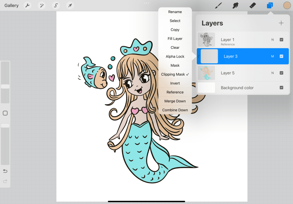
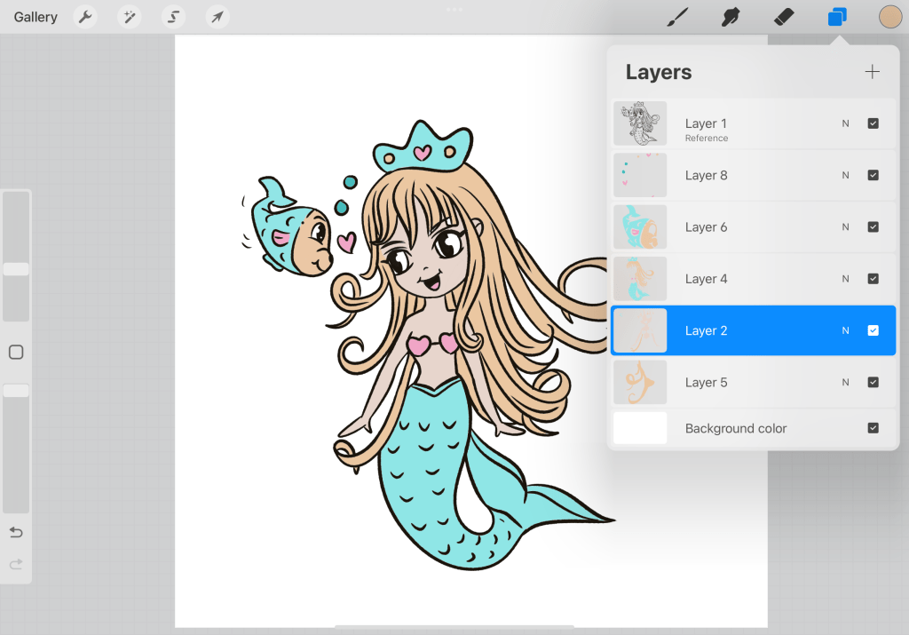
Once you are done with applying basic color, create a new layer…Here I have merged all the previous color layers in one by merge. But if you want you can keep them by duplicating each layer grouping them and deactivating them, so you can see the merged layer. The new layer on top is going to be used in order to create shadows. So you will need to assign it as a clipping mask.
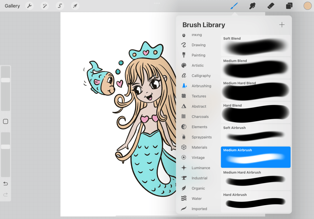
From the Procreate original brushes go to Air Brushing and choose> Medium Airbrush. You need to set the new shadow layer into the multiply and experiment a bit with the opacity of the layer and the opacity of the brush. The result should be semi-transparent.
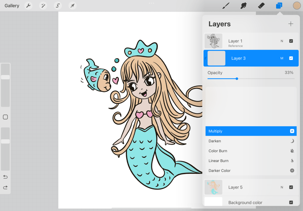
I have set it to 33% percent and have reduced the opacity of the brush. Now here is the thing in the first round I never apply shadows, I apply dimension (volume and color variation). So yes it’s shadows but its purpose is not to give us information about where the light comes from (because if you don’t have scenery it can come from everywhere and in clipart this is not the purpose, in paintings and artistic work yes). Its purpose is to give us dimension. Information pleasing to the eye. I could write an essay about it…LOL…
I leave you here because that’s a big tutorial as I am so eager to let you know things…Hope I can update you soon. Hoped you liked it so far.
