I want to share with you some insight on how I am working with fonts. This post also includes my favorite programs, tools and ordinary routines.
Here we Go…
Starting with the Fonts….
As a typography lover I am a bit obsessed with fonts. I was always in quest of new fonts that I could incorporate into my projects and over the years, before making my own digital files to sell, I made many projects such as flyers, logos, banners, booklets, posters, all sort of creative work that a designer could work on. So going all over fonts, trying to find the one that best matches my client’s project, was a ordinary part of my job but trilled me nevertheless…
Buying, purchasing and investing on fonts led me to a number of 7100 still loading fonts and limited hard disk space LOL. But I can’t help it, so when I see a new font (specially the script fonts) I want to have it.

I really love all my fonts and I can’t wait the time to use them in my projects and files.

Therefore a love for Typography Quotes in the form of Cut Files was born….
So number 1 Element: Purchased Fonts New and Old, Classic and Modern… I always work with purchased fonts not only supporting fellow font designers but also loving the variety and uniqueness they can provide.
Working in AI

Adobe Illustrator It’s my favorite program working on typography and vectors. To be honest over the years no other program I believe is faster, more reliable, and super easy to edit vectors like Abode Illustrator. It’s great to design with and efficient. Plus it’s the extremely professional.
Creating a Canvas
I create all my projects to be 12×12 inches. Why? Because Silhouette Cameo and Cricut (the most popular cutting machines) cut in these dimensions as their maximum width size. So It’s easier for proportion reasons to design at these dimensions and then the user can minimize as he/she wishes.
Starting with Text…


You know the more fonts you have the more difficult it can become to choose the ones that go well together? Well for designers there are always some basic font and design rules that can make their life easy. Still, font combinations can be a daunting task and literally take a lot of time if you want to experiment. But then is there a better way to achieve a nice design?
Combining fonts + Designs
That’s where these guys come into play…
 +
+ 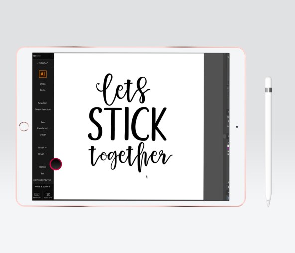
That’s Astropad running on ipad Pro + Apple Pencil and what that does is it allows to take control of Adobe Illustrator from your Ipad. I used to work with wacom tablet but after hearing some many good reviews after Apple Pencil I decided to give it try and I have to confess; the grip, the flow, the precision is really something else.
So after turning my ipad on a tablet now I can draw in Adobe straight from my ipad. And that’s where the fun part begins…
Once the font is turned into vectors, each element is edited and new hand drawn design elements are added to transform the design into something new as long as unique. I always try to combine cut lines together for a smooth cutting.


Drawing over the original vectors is a fan way to give a personal touch and style to the vectorized letters.


It’s also nice to work with the flow of the design and editing the letters to flow along, matching the lines of the letters above.


Additional elements that I draw with Appe Pencil give a fan vibe and define better the layout.


From what I know the design process can go on forever…. but inevitable has to stop somewhere. So here is the Before and the After Version. I have no doubt that the serious first version is ok and perhaps would sell well as a cutting file but it’s not that personalized. I like all of my designs to have my personal vibe and feel and be different, so they can not be copied. This also protects and my customers when purchasing my files. Their files are unique and I really enjoy the fact that I can offer this to them.

